Skip to the content
Moûsa

One arm of a comparison · With Qloo

Moûsa, explained to the jury: Claude Code: With Qloo

Host
Claude Code 2.1.284
Model
claude-opus-5-5[1m]
Moûsa
0.7.0
Started
24 October 2026
Time
10.6 minutes, 23 turns
Qloo requests
15
Pictures
none: imagery drawn in SVG or CSS

Play it

The design's own files as the session left them, running sandboxed on a separate origin.

Moûsa · Taste Provenance

For an audience that loves This Week in Startups, The Original Kings of Comedy, Los Angeles Dodgers, Chelsea F.C. and Live Nation

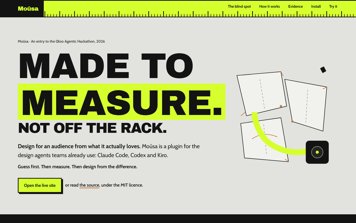
A made-to-measure page: clean neutral cloth printed like athletic packaging in heavy grotesque capitals and one electric colour, with the story told between the labels in close, subtitled documentary frames and the work laid out as a training log.

Design with QlooWebsiteClaude CodePrediction frozen 24 October 2026Sealed bf3eb5e97d28

10 of 10

design devices rest on what the model did not predict

The audience, as the person named itThis Week in StartupsThe Original Kings of ComedyLos Angeles DodgersChelsea F.C.Live Nation

68works measured, 3 of them predicted

18shared qualities, 1 predicted

24pacing, surface and tone tags, 1 predicted

15Qloo requests

The result

The captures of round 2, the last the agent reviewed: 2 criteria met, 1 partly, 1 missed.

desktop, round 2
desktop · round 2 · judged in the review
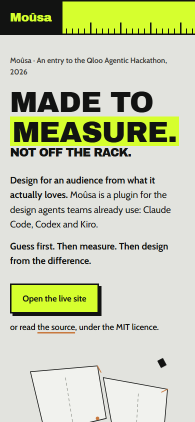
mobile, round 2
mobile · round 2
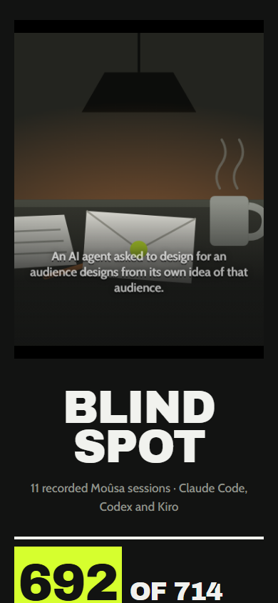
mobile · cold-open, round 2
mobile · cold-open · round 2 · judged in the review
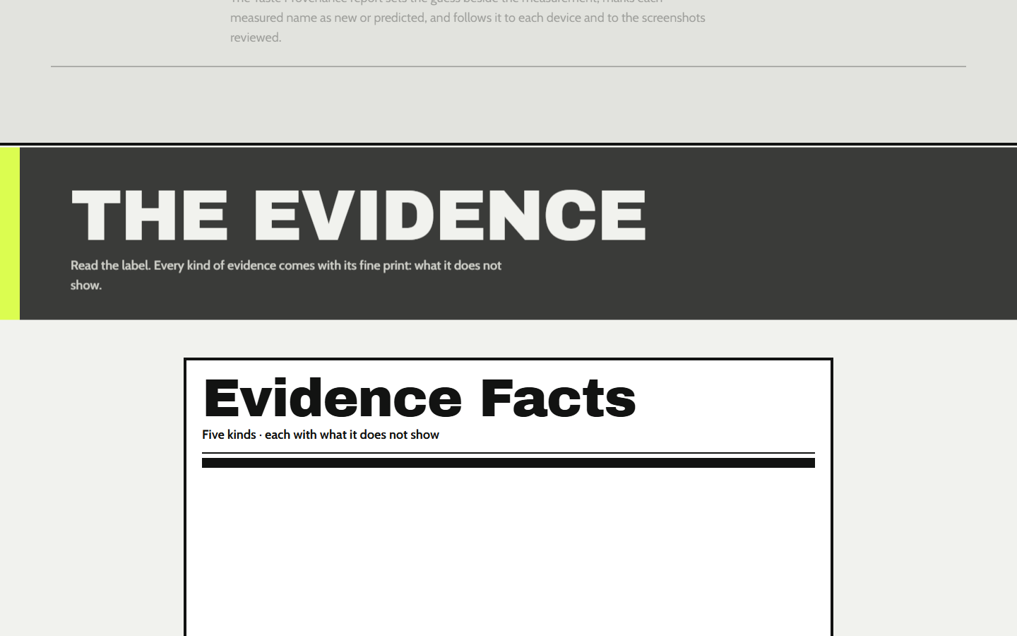
desktop · evidence-facts, round 2
desktop · evidence-facts · round 2 · judged in the review
mobile · training-log, round 2
mobile · training-log · round 2 · judged in the review
desktop · ensemble, round 2
desktop · ensemble · round 2

Before any data: the model's own prediction

Frozen before Qloo was asked, so what Qloo adds can be told apart from what the model already assumed. An entry a measured name matches is marked; the match is liberal, so it only lowers what counts as new.

The design the model would make from it alone

A dark, stadium-scoreboard landing page in Dodger and Chelsea blues with heavy condensed broadcast headlines, the evidence as a stat scoreboard and the five steps as a game-day lineup card.

#0a1a3f#005a9c#ffffff#ef3e42#f5c518

Type: Anton and Barlow Condensed

#hero#problem#scoreboard#how-it-works#evidence#agents#try-it#built
  • stadium scoreboard numbers
  • lineup card
  • ticket stub
  • broadcast lower-third

The audience it expected

Founder- and investor-minded media people who also live for live events: big-market sports fandom (Dodgers, Chelsea), arena concerts and Black stand-up comedy. They value hustle, scoreboard results and a crowd's energy.

Pacing

fast-pacedpunchy cutslive broadcast energy matched Energetic (look quality)conversational

Surfaces

stadium lightsbold scoreboard typeglossy arena stagingteam colors

Tone

confidentirreverentcompetitivecelebratory measured

Shared qualities

underdog hustlebig-stage spectaclebanter and roast humourwinning as proof

The works it expected them to love

Brands

NikeESPN measuredTicketmasterSpotifyApple matched After Steve: How Apple Became a Trillion-Dollar Company and Lost Its Soul (book)Tesla

Films

FridayBad BoysThe Social NetworkMoneyballComing to America

Music

Jay-ZDrake matched Drake&OrsonKendrick LamarBeyoncéKanye West

Books

The Hard Thing About Hard ThingsZero to OneShoe DogThe Lean Startup

TV

Silicon ValleyShark TankTed LassoMartinThe Bernie Mac Show

Sealed at the freeze: SHA-256 bf3eb5e97d28a261993738fefffb0193ac08f6c60e9b641718787ccb4493937d. The prediction shown here still matches it.

What Qloo measured

What this audience loves, the qualities those works share and the tags ranked for it. New means the prediction did not contain it.

Look qualities

  • Bold Typography newin National Football League, ESPN and Gatorade G2 · ×2.73 as often as across audiences
  • Intimate newin Jeremih, Men of a Certain Age and Family Tree · ×1.55 as often as across audiences
  • Realistic newin Camping, Breeders and Froning: The Fittest Man in History · ×2.27 as often as across audiences
  • Engaging newin Jeremih, 2 Chainz and J. Cole · ×2.23 as often as across audiences
  • Energetic predictedin 2 Chainz, J. Cole and Trey Songz · ×1.67 as often as across audiences

Mood qualities

  • Determined newin I'll Sleep When I'm Dead, Born Strong and Eddie - Strongman · ×2.91 as often as across audiences
  • Resilient newin Loudermilk, Roadies and Iverson · ×2.66 as often as across audiences
  • Emotional newin Drake&Orson, Coach Carter and Glory Road · ×1.85 as often as across audiences
  • Melodic newin Jeremih, Drake&Orson and Trey Songz · ×2.27 as often as across audiences
  • Complex newin Men of a Certain Age, Loudermilk and Whites · ×2.2 as often as across audiences

Meaning qualities

  • Resilience newin Mo, Born Strong and KidPoker · ×3.25 as often as across audiences
  • Relationships newin Jeremih, Big Sean and Trey Songz · ×3.1 as often as across audiences
  • Diverse newin 2 Chainz, Trey Songz and T-Pain · ×2.89 as often as across audiences
  • Perseverance newin Meek Mill, Creed and Froning: The Fittest Man in History · ×2.85 as often as across audiences
  • Professional Athletic Achievement newin Gatorade G2, National Basketball Association and New York Yankees · ×2.7 as often as across audiences

Pacing

Hauntingly Intimate newKid-Friendly newSpiritual newUrban newMeta Humorous newQuick-Paced new

Surfaces

Tailored Fit newVersatile Styles newFeminine Silhouettes newversatile pieces newClean newNeutral Palettes new

Tone

Modern newCelebratory predictedReliability newElegant newDetermination newPassion new

Brands

  • LA Kings newBlack And Silver Palette · Minimalist Logo Design · Iconic Visual Branding
  • National Football League newBold Typography · Shield Insignia · Red White And Blue Color Palette
  • Pandora newMinimalist · Clean Typography · Function-First Design
  • ESPN predictedBold Typography · High-Contrast Graphics · Dynamic Motion Design

Brands, lesser known

  • Gatorade Zero newBold Typography · Vibrant Color Palette · High-Contrast Branding
  • New York Yankees newPinstripe Uniforms · Interlocking Lettering · Classic Navy And White Palette

Films

  • War Dogs newDeath threat · Iwi jericho 941 · Sportscar
  • Iverson newRebellious · Resilient · Cultural impact
  • Straight Outta Compton newPragmatic · Conflicted · The fall
  • The Founder newComplex · The self made man · American midwest

Films, lesser known

  • A Kid from Coney Island newCommunity focused · Interview centric · Intimate
  • I'll Sleep When I'm Dead newObservational · Stage backstage juxtaposition · Emotional

Music

  • Jeremih newIntimate · Engaging · Melodic
  • 2 Chainz newEnergetic · Engaging · Bass Heavy
  • Big Sean newMainstream Rap · Lyrical Hip Hop · Confident
  • Drake&Orson predictedDynamic · Emotional R&B · Melodic

Books

  • After Steve: How Apple Became a Trillion-Dollar Company and Lost Its Soul predictedBiography Memoir · Nonfiction · Technology
  • Bruce Lee: A Life newBiography Memoir · Audiobook · Film
  • Kamala's Way: An American Life newAudiobook · Politics · Womens
  • Der Sinnreiche Junker Don Quixote Von La Mancha ...... (German Edition) new

TV

  • Men of a Certain Age newBreakfast table intimacy · Intimate · Flawed
  • Camping newUnvarnished close ups · Improvisational energy · Observational
  • Crashing newCameo heavy realism · Improvisational tone · Ambitious
  • Breeders newKitchen sink realism · Realistic · Mundane intimacy

Cautions the measurement raised

  • Bold Typography is carried mostly by brands (National Football League, ESPN, Gatorade G2): it is the design this audience sees every day. Translate the genre of that design, such as broadcast graphics, packaging type or signage, never a brand's logo, mascot, exact colours or products.

How the agent read it

Before deciding anything, the agent grouped what belongs together. Each cluster rests on a quality; the works are its evidence.

c1 · carries palette and typography

The label on the bottle

InterpretationThe brands this audience lives with every day speak in oversized, heavy type and one loud colour on a plain field: Bold Typography carries the highest look lift and it comes from athletic packaging and broadcast graphics, not from arenas at night.

How these works look, as a genre

  • sports-drink packaging: oversized heavy grotesque capitals stacked edge to edge, one vibrant flavour colour on a plain neutral field
  • nutrition-facts panels: a boxed table of heavy rows and thick bars, with the fine print set small underneath
Bold Typography look quality · newGatorade G2 brand · newGatorade Zero brand · newNational Football League brand · newESPN brand · predictedEngaging look quality · new

c2 · carries imagery, motion and layout

Close and unvarnished

InterpretationThe TV and music are not spectacle: breakfast-table intimacy, unvarnished close-ups, kitchen-sink realism and slow melodic R&B. The audience trusts what looks unstaged and close.

How these works look, as a genre

  • observational documentary: tight handheld frames, letterboxed, with burned-in white subtitles at the bottom
  • kitchen-sink television: a domestic table under one tungsten lamp, muted colour, nothing styled
Intimate look quality · newRealistic look quality · newMen of a Certain Age TV · newCamping TV · newBreeders TV · newHauntingly Intimate pacing · newJeremih music · newMelodic mood quality · new

c3 · carries imagery and palette

Made to measure

InterpretationThe surfaces they favour are tailored and clean in neutral cloth colours; reliability is a tone. A fit is something measured, which is exactly what this product does.

How these works look, as a genre

  • tailoring: chalk marks, a tape measure and paper pattern pieces laid on plain cloth
Tailored Fit surface · newClean surface · newNeutral Palettes surface · newReliability tone · newModern tone · new

c4 · carries voice and structure

The long road

InterpretationThe films that rise highest are sports and strength documentaries about grinding through: determination and resilience carry the largest mood and meaning lifts. Relationships carry the music.

How these works look, as a genre

  • sports documentary title cards: one heavy word over a dark frame, with a small date and place under it
  • training logs: day-by-day entries, sets ticked off, notes in the margin
Determined mood quality · newResilience meaning quality · newPerseverance meaning quality · newResilient mood quality · newIverson film · newBorn Strong film · newRelationships meaning quality · newDetermination tone · new

How the medium carries itA clean, neutral, made-to-measure web page. The facts are printed like athletic packaging: heavy grotesque capitals and one vibrant colour, with the evidence as a nutrition-facts label whose fine print says what each kind of evidence does not show. Between the labels the story is told in documentary frames: a dark letterboxed close-up of a kitchen table with a sealed guess on it, with subtitles that rise slowly. The five steps run as a training log, the three agents as an ensemble of interview lower-thirds, and a tape measure drawing ties the idea together: made to measure, not off the rack.

Set aside as noise

  • War Dogs film · new Its leading tags (death threat, a rifle model, sportscar) are plot props, not a look or mood this page could carry for a jury.
  • Der Sinnreiche Junker Don Quixote Von La Mancha ...... (German Edition) book · new A catalogue edition with no tags, outside what the rest of the books share (biography and memoir).

The Design DNA

10 binding devices with literal tokens the check looks for in the files. 10 rest on what the prediction did not contain.

palette · dna1In the files

Flavour colour on plain cloth

Anchored to

Bold Typography look quality · newGatorade G2 brand · newNeutral Palettes surface · new

Translates: Bold Typography · Vibrant Colors · Neutral Palettes

Through the convention: sports-drink packaging: oversized heavy grotesque capitals stacked edge to edge, one vibrant flavour colour on a plain neutral field

InterpretationPackaging draws Bold Typography as heavy ink on a plain field with one vibrant flavour colour. Here the field is a cool, clean cloth grey, the ink a near-black, and the single flavour colour an electric chartreuse used only behind the loudest words and numbers. A dark olive-black is the documentary frame and a tungsten amber the one lamp inside it. No brand's own colours: the chartreuse is a genre's vibrancy, not a bottle's.

#e2e3de#121312#d6ff2e#23241f#c8793f#8c8f87

Made with css-palette for “The label on the bottle”: Six custom properties on :root carry the cloth, ink, flavour, frame, lamp and steel values used everywhere through var().

Away from the sketch: 5 colours

typography · dna2In the files

Stacked label capitals over a plain humanist text

Anchored to

Bold Typography look quality · newGatorade G2 brand · new

Translates: Bold Typography · Athletic Branding

Through the convention: sports-drink packaging: oversized heavy grotesque capitals stacked edge to edge, one vibrant flavour colour on a plain neutral field

InterpretationBold Typography set the way sports-drink labels set it: a heavy, wide grotesque in capitals, stacked with tight leading so words run edge to edge, against a quiet humanist sans for the reading text and the subtitles. Not the condensed scoreboard faces I would have chosen.

Made to measure. Not off the rack.

Archivo Black

Made to measure. Not off the rack.

Cabin

line-height: .86letter-spacing: -.02em

Made with library-font for “The label on the bottle”: Archivo Black and Cabin fetched into fonts/ and loaded with @font-face; heading rules set the tight label leading and tracking.

Away from the sketch: 2 type families

imagery · dna5In the files

The kitchen table with the sealed guess

Anchored to

Men of a Certain Age TV · newIntimate look quality · new

Translates: Breakfast table intimacy · Intimate

Through the convention: kitchen-sink television: a domestic table under one tungsten lamp, muted colour, nothing styled

InterpretationBreakfast-table intimacy drawn as a flat inline SVG inside the cold open: a table edge, a mug, a lamp's warm pool, a notebook and a sealed envelope that stands for the frozen guess. Muted, one tungsten light, nothing staged.

svg#kitchen-table

Made with inline-svg for “Close and unvarnished”: A flat drawing of the table scene lives inside the cold open, so it can push in and needs no picture generator.

imagery · dna6In the files

Tape measure and pattern pieces

Anchored to

Tailored Fit surface · newClean surface · new

Translates: Tailored Fit · Clean

Through the convention: tailoring: chalk marks, a tape measure and paper pattern pieces laid on plain cloth

InterpretationTailored Fit becomes the page's emblem: an inline SVG tape measure unrolling across paper pattern pieces with chalk marks, drawn in clean single-weight lines on the cloth grey. Made to measure is what the product does.

svg#tape-measure@keyframes tape-unroll

Made with inline-svg for “Made to measure”: A line drawing whose tape path unrolls with stroke-dashoffset when it enters the view: the signature moment.

motion · dna7In the files

Slow subtitle rise and a long push-in

Anchored to

Hauntingly Intimate pacing · newJeremih music · new

Translates: Hauntingly Intimate · Melodic

InterpretationHauntingly Intimate pacing: subtitles fade up slowly one line after another with a soft ease and no overshoot, and the cold-open drawing pushes in over fourteen seconds, once. Melodic, not punchy; no tickers.

@keyframes subtitle-rise@keyframes push-inanimation: push-in 14s cubic-bezier(.25,.1,.25,1) both

Made with css-motion for “Close and unvarnished”: Keyframes for the subtitle rise with staggered delays and a single long push-in on the drawing, both removed under reduced motion.

voice · dna10In the files

Training-day lines, short and determined

Anchored to

Determined mood quality · newDetermination tone · newReliability tone · new

Translates: Determined · Determination · Reliability

InterpretationDetermined and reliable: short declarative lines that sound like a coach before a session, with the facts left exactly as they are.

Made to measure. Not off the rack.
Guess first. Then measure. Then design from the difference.
The guess is sealed before the tape comes out.

Made with copy for “The long road”: The headline, the cold open's last subtitle and section intros carry the lines; every fact keeps its number and name.

layout · dna4In the files

Letterboxed cold open with burned-in subtitles

Anchored to

Camping TV · newIntimate look quality · new

Translates: Unvarnished close ups · Intimate

Through the convention: observational documentary: tight handheld frames, letterboxed, with burned-in white subtitles at the bottom

InterpretationThe problem opens like an observational documentary: a dark 2.39:1 frame, tight on a table, with the facts arriving as white subtitles at the bottom rather than as a headline. Unvarnished close-ups become a frame with no chrome.

#cold-openaspect-ratio: 2.39 / 1

Made with css-layout for “Close and unvarnished”: A dark frame with a 2.39 / 1 aspect ratio on desktop, the drawing behind and subtitles absolutely placed at the bottom.

Away from the sketch: 1 new part

structure · dna3In the files

The evidence as a nutrition-facts label

Anchored to

Bold Typography look quality · newRealistic look quality · new

Translates: Bold Typography · Realistic

Through the convention: nutrition-facts panels: a boxed table of heavy rows and thick bars, with the fine print set small underneath

InterpretationEach kind of evidence becomes a row of a boxed facts panel with thick bars between groups; the line about what it does not show is printed as the label's fine print, so the honesty is part of the package. Realistic: plain numbers, nothing dramatized.

#evidence-factsborder: 4px solid var(--ink)

Made with css-layout for “The label on the bottle”: A boxed facts panel built from a definition list with thick group bars, fine print under each row, styled in CSS grid.

Away from the sketch: 1 new part

structure · dna8In the files

The five steps as a training log

Anchored to

Resilience meaning quality · newPerseverance meaning quality · new

Translates: Resilience · Perseverance

Through the convention: training logs: day-by-day entries, sets ticked off, notes in the margin

InterpretationResilience and perseverance become the spine of how it works: the five steps as entries in a training log, each a session ticked off with a short note in the margin, read in order like days of a programme.

#training-log

Made with css-layout for “The long road”: An ordered list styled as log entries with a session column, a tick box and a margin note.

Away from the sketch: 1 new part

structure · dna9In the files

Three agents as an ensemble of lower-thirds

Anchored to

Relationships meaning quality · newIverson film · new

Translates: Relationships · Resilient

InterpretationRelationships become the ensemble: Claude Code, Codex and Kiro each introduced as a documentary interview lower-third, a name bar and a role line, with the install commands beneath. One engine, three voices.

#ensemble

Made with css-layout for “The long road”: Three lower-third bars, a heavy name bar in flavour colour with a role line under it, and the commands in a plain code block.

Away from the sketch: 1 new part
Away from the sketch

The design's palette, type and parts against the sketch frozen with the prediction. A colour counts as moved at a CIE76 difference of 20 or more from every sketch colour.

Sketch palette

#0a1a3f#005a9c#ffffff#ef3e42#f5c518

Design palette: 5 of 6 moved

#e2e3deΔE 10 from #ffffff#121312ΔE 28 from #0a1a3f#d6ff2eΔE 43 from #f5c518#23241fΔE 31 from #0a1a3f#c8793fΔE 41 from #ef3e42#8c8f87ΔE 41 from #ffffff

Type

Sketch: Anton and Barlow Condensed. Design: Archivo Black (new), Cabin (new).

Parts

Sketch sections: #hero #problem #scoreboard #how-it-works #evidence #agents #try-it #built

New in the design

#evidence-facts#cold-open#training-log#ensemble

Questions asked while designing

Each question was asked with the agent's own guess written first, so the answer's difference stays visible.

Which surfaces, materials and forms do they favor?

Page ground and material: a dark arena/broadcast ground versus a light neutral, tailored ground

The agent's guess, written firstDark, glossy, high-contrast surfaces like stadium lights and arena staging; I would pick a near-black navy ground.

Qloo's answer, 0 requests

Surfaces Tailored Fit (new), Versatile Styles (new), Feminine Silhouettes (new), versatile pieces (new), Clean (new), Neutral Palettes (new)

How do the films and series they love move?

Motion of the page: fast punchy broadcast cuts versus slow intimate reveals

The agent's guess, written firstFast-paced, punchy cuts with live broadcast energy: tickers and scoreboard flips.

Qloo's answer, 0 requests

Pacing Hauntingly Intimate (new), Kid-Friendly (new), Spiritual (new), Urban (new), Meta Humorous (new), Quick-Paced (new)

The review

The agent judged each criterion of its plan on the captures it took, then repaired what fell short. The verdicts are its own.

The hero repair and the generic replacements landed: one-line stacked label capitals, a tape-measure top bar, one CTA with a plain text link, and documentary chapter bands for section heads. But the entrance animation still hides content at the moment a section is reached: the evidence panel and the ensemble band show blank or faded in the captures, which is the page's most important failure.

met

The hero headline reads as stacked heavy grotesque capitals running nearly edge to edge with a chartreuse block behind one line, on a cool grey field, not a dark navy page.

Observed in r2-desktopMADE TO now holds one line, MEASURE. sits in its own chartreuse block without touching the lines above or below, and NOT OFF THE RACK. stacks under it: heavy grotesque capitals running nearly across the column on the cool grey cloth, with the tape-measure strip as the top bar. One flaw outside the criterion: the yellow tape in the drawing stops short of its end tab, so the tab floats.

partly

The cold open is a dark letterboxed frame with the table drawing and white subtitles centred at its bottom; on mobile the subtitles stay legible and inside the frame.

Observed in r2-mobile-cold-openThe recomposed frame keeps the lamp, the notebook edge, the sealed envelope with its chartreuse seal and the steaming mug inside the 4:5 crop, black letterbox bars above and below, and the scrim makes the white subtitle clean to read. Only the first subtitle line has risen at the moment of capture; the other two are still waiting on their delays.

RepairBring the three subtitle lines in together with a shorter stagger, so the whole sentence is present within about a second, keeping the slow rise itself.

missed

The evidence reads as a boxed nutrition-facts style panel with thick bars between rows and small fine print saying what each kind does not show.

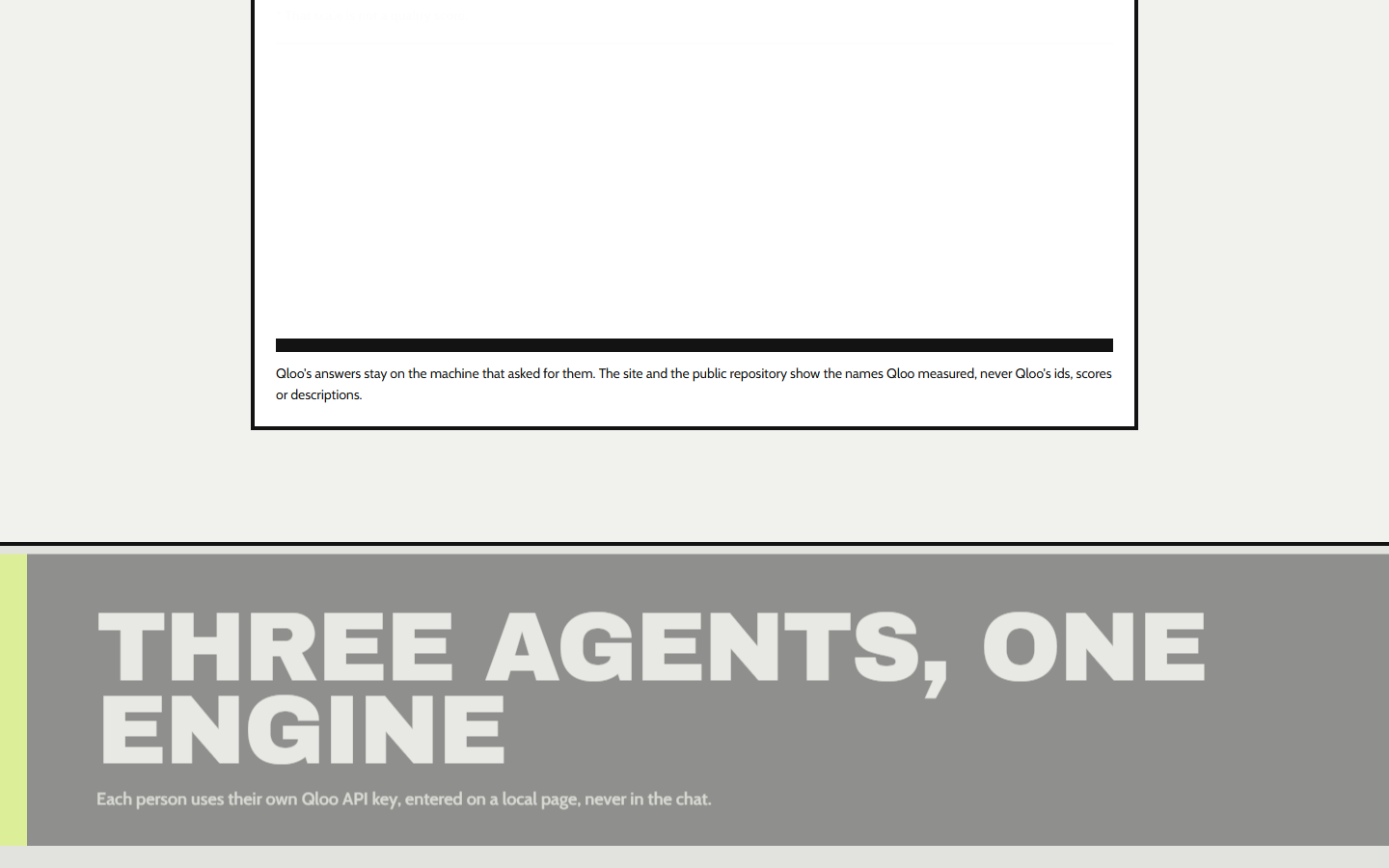
Observed in r2-desktop-evidence-factsThe chapter band THE EVIDENCE and the boxed Evidence Facts head with its rule and thick bar read as a label, but every fact row below the bar is blank: the rows are still at their hidden entrance state when the capture jumps to the section, so the panel shows an empty white box.

RepairStop hiding content for the entrance: rows, entries and cards stay fully opaque and only slide a few pixels into place, so a jump to any section always shows the facts.

met

The five steps read as a training log: rows with a tick box, a session label and a margin note, not as a numbered card grid.

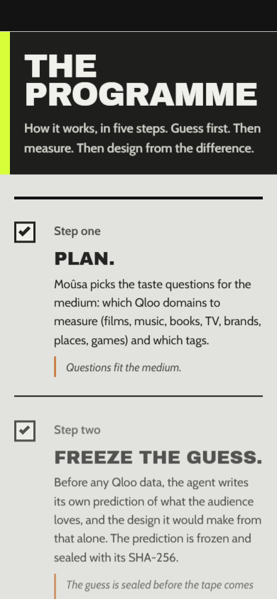
Observed in r2-mobile-training-logA dark chapter band with a chartreuse edge titles THE PROGRAMME, then the log: ticked boxes, Step one and Step two in small bold, PLAN. and FREEZE THE GUESS. in label capitals, the text, and italic margin notes on an amber rule. It reads as a training log, not a card grid.

Its three most generic choices, by its own eye

  • replaced Scroll entrances that fade content in from invisible, so a jump to a section shows blank rows.
  • kept All-caps heavy headings on every section. kept for Bold Typography
  • kept A single filled call-to-action box with an offset shadow. kept for Gatorade G2

Would someone who loves Jeremih, J. Cole, Men of a Certain Age, Iverson and Gatorade G2 take it for theirs?partly: The tape-measure bar, label capitals with one loud colour, the lamp-lit kitchen table with a sealed envelope and the training log read as theirs, close and determined rather than arena spectacle. But a blank evidence panel and a faded ensemble band would read as broken to anyone, so the page is not yet theirs.

What earlier rounds found short, and the repairs

Round 1: 1 met, 3 partly, 0 missed. The departure from the frozen sketch reads: a cool grey cloth page, label capitals and one electric flavour colour instead of a dark blue scoreboard, and a documentary frame instead of a stat ticker. The hero highlight collides with its lines, the cold open crops its sealed envelope on mobile, and the entrances are too slow for the evidence to read.

partly

The hero headline reads as stacked heavy grotesque capitals running nearly edge to edge with a chartreuse block behind one line, on a cool grey field, not a dark navy page.

Observed in r1-desktopHeavy Archivo Black capitals stack on a cool grey field with a chartreuse block behind MEASURE, and the page is clearly not a dark navy scoreboard. But MADE TO breaks onto two lines, and with the .86 leading the chartreuse block rides up over the bottom of TO and down behind NOT OFF THE RACK, so the lines collide instead of stacking edge to edge.

RepairSize the headline so MADE TO holds one line, set the highlight as its own inline-block with a line-height of 1 and a small vertical inset, and give the stacked lines a little space so the block sits inside its own line.

partly

The cold open is a dark letterboxed frame with the table drawing and white subtitles centred at its bottom; on mobile the subtitles stay legible and inside the frame.

Observed in r1-mobile-cold-openA dark letterboxed frame with black bars, the lamp, the table and white burned-in subtitles inside its bottom edge. Only the first subtitle has risen at capture time, it sits over the notebook's ruled lines so it reads busy, and the sealed envelope is cropped off the right edge at the 4:5 crop.

RepairRecompose the drawing so the notebook, envelope and mug sit in the centre third that survives the mobile crop, add a dark scrim along the bottom of the picture behind the subtitles, and shorten the gaps between the subtitle lines.

partly

The evidence reads as a boxed nutrition-facts style panel with thick bars between rows and small fine print saying what each kind does not show.

Observed in r1-desktop-evidence-factsThe panel reads as a nutrition-facts style label: a boxed white panel, the heavy Evidence Facts head, a thin rule and a thick black bar, the first row with its value tag and fine print starred underneath. But the section head and the rows are still mid-fade at capture, so the rows read pale grey and barely legible.

RepairShorten the entrance transitions to well under a second and start them earlier, keeping the slow pacing for the subtitles and the push-in only.

The check

Whether each device's declared tokens are in the project's files, through its own design system, and how much of the look models default to the page kept.

1.00 conformance · 10 of 10 devices in the files · design system: css-vars

dna1 presentdna2 presentdna3 presentdna4 presentdna5 presentdna6 presentdna7 presentdna8 presentdna9 presentdna10 present

Styling at the start: 0 hand-written declarations and 0 classes; now 509 and 182.

The look models default to: 0 of its 12 signatures on the page; at most 2 may stay.

Limits

  • Qloo measured the entities, tags and shared qualities named here and how they relate to this audience. Every colour, font, layout, motion and line drawn from them is the agent's interpretation, marked as such.
  • A name marked new was not in the prediction the agent froze before any data. Only names are published here: Qloo's ids, affinity scores, popularity and descriptions stay in the project.
  • The check shows that the declared tokens are in the files, not that the design is good. The review is the agent's own reading of its captures.
  • One session is one sample. It shows where this design's choices came from, not that people prefer it.

Back to the comparison