Skip to the content
Moûsa

One arm of a comparison · With Qloo

A record shop's website, for people who love Paterson and Nujabes: With Qloo

Host
Kiro 2.24.0
Model
claude-opus-5.5
Moûsa
0.7.0
Started
24 October 2026
Time
7.2 minutes
Qloo requests
12
Pictures
none: imagery drawn in SVG or CSS

Play it

The design's own files as the session left them, running sandboxed on a separate origin.

Moûsa · Taste Provenance

For an audience that loves Paterson and Nujabes

Wax & Wane as a photocopied shop zine: toner on grey copier paper with one riso-blue ink, stamped white-label records, a typewritten week and a black title card for Thursday, spoken to the regulars.

Design with QlooWebsiteKiroPrediction frozen 24 October 2026Sealed be8e3435a247

7 of 7

design devices rest on what the model did not predict

The audience, as the person named itPatersonNujabes

69works measured, 1 of them predicted

18shared qualities, 3 predicted

24pacing, surface and tone tags, 3 predicted

12Qloo requests

The result

The captures of round 2, the last the agent reviewed: 5 criteria met, 0 partly, 0 missed.

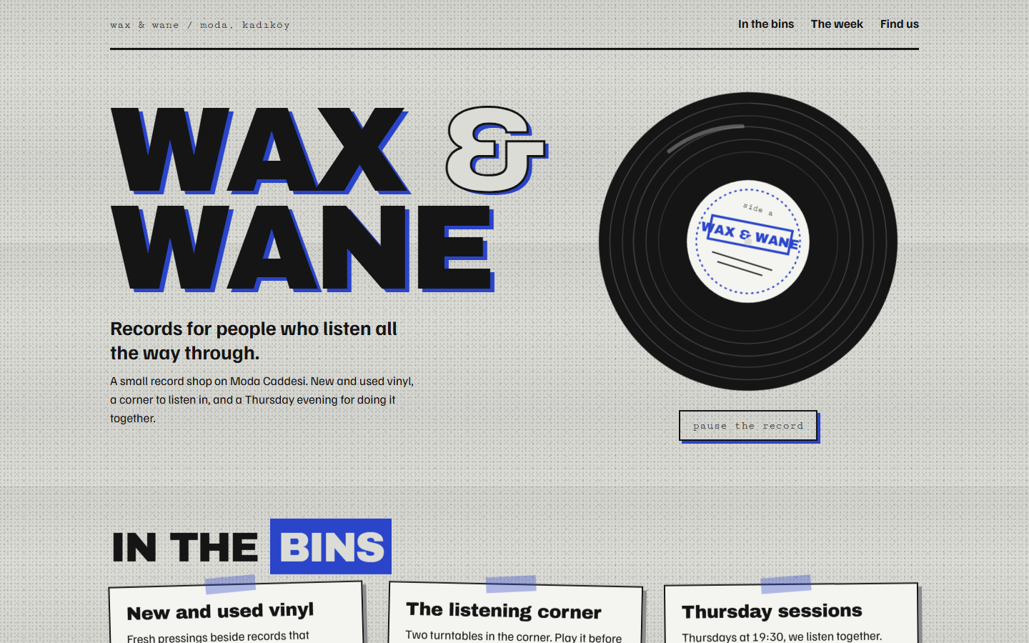
desktop, round 2
desktop · round 2 · judged in the review
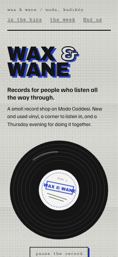
mobile, round 2
mobile · round 2
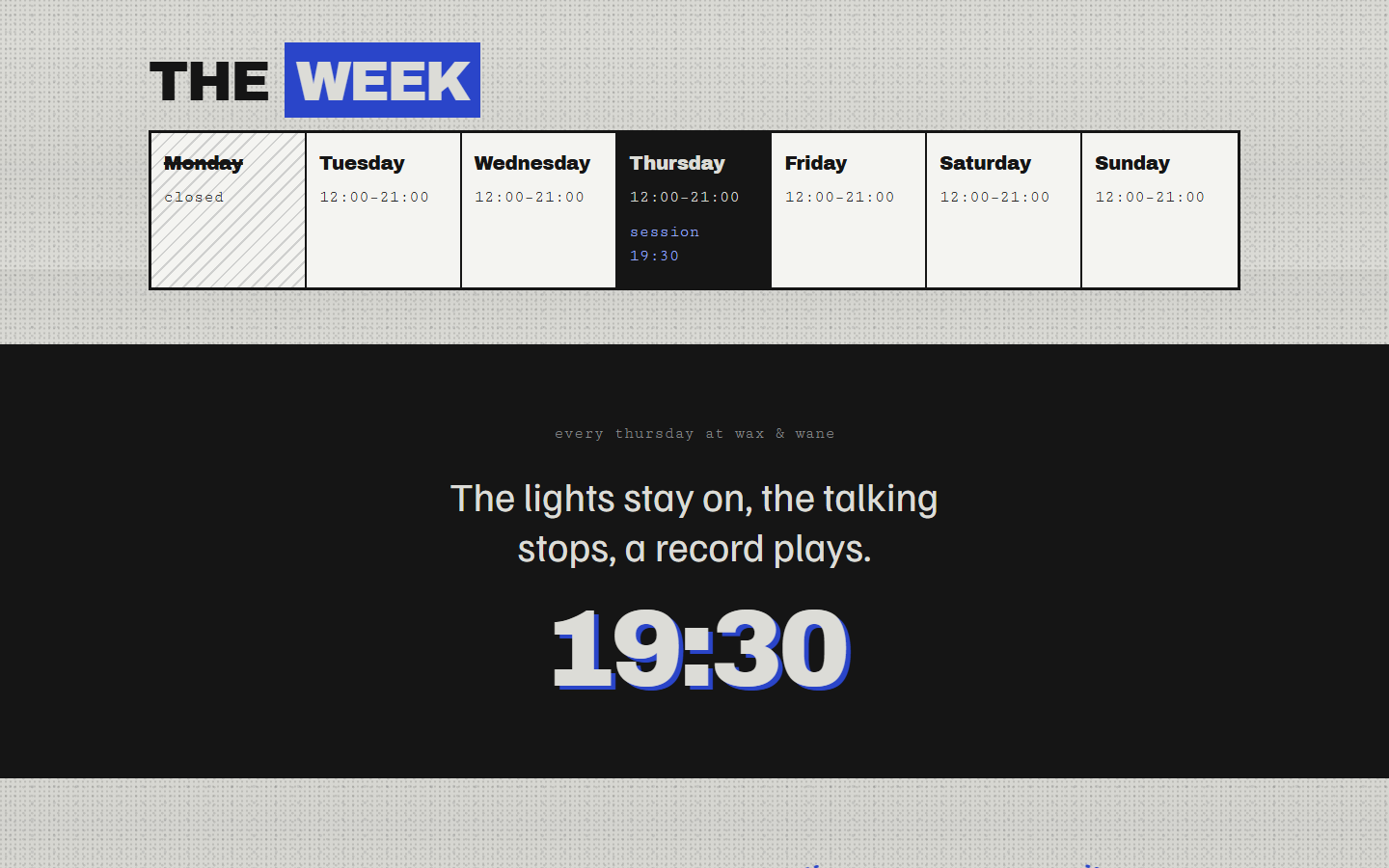
desktop · week-programme, round 2
desktop · week-programme · round 2 · judged in the review
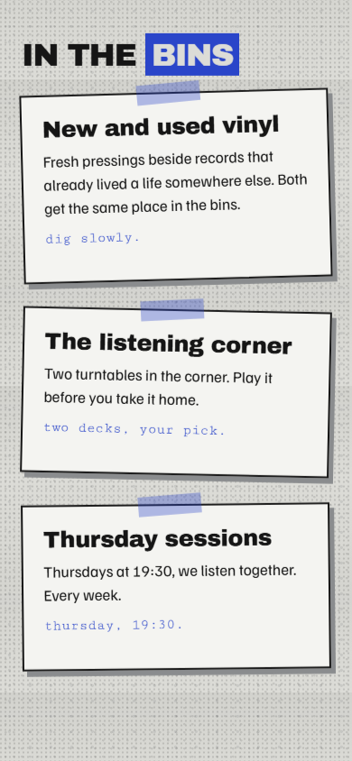
mobile · shelf-cards, round 2
mobile · shelf-cards · round 2 · judged in the review
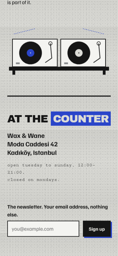
mobile · counter, round 2
mobile · counter · round 2 · judged in the review

Before any data: the model's own prediction

Frozen before Qloo was asked, so what Qloo adds can be told apart from what the model already assumed. An entry a measured name matches is marked; the match is liberal, so it only lowers what counts as new.

The design the model would make from it alone

A warm, slow one-page shop site like a liner-notes booklet: cream-on-brown paper, a spinning record in the hero, typewriter details and a poem-like intro, with hours and Thursday sessions set as a track list.

#2b2118#f1e6d2#c2703d#6b7a5a#e0b95b

Type: Literata, Courier Prime and Caveat

#hero#shop#listening-corner#sessions#visit#newsletter
  • slowly spinning record
  • track-list hours
  • notebook poem lines
  • paper grain
  • waxing and waning moon phases

The audience it expected

People drawn to quiet, everyday poetry and warm, jazz-sampling lo-fi hip hop: patient listeners who value routine, craft, small rituals and melancholy calm over spectacle.

Pacing

slow-pacedcontemplativeminimalist measuredepisodicquiet measured

Surfaces

analog warmthfilm grainmuted earth toneshandmadelo-fi texture matched Lo-Fi (mood quality)

Tone

melancholic measuredgentleintrospective measurednostalgic measuredhopeful

Shared qualities

everyday poetryritual and routinejazz influenceurban solitudeunderstated humor

The works it expected them to love

Brands

MujiMoleskineAudio-TechnicaCriterion CollectionKinfolkAesop

Films

Lost in TranslationPerfect DaysCoffee and CigarettesSpirited AwayIn the Mood for LoveBroken Flowers

Music

J Dilla measuredShing02Uyama HirotoBonoboKhruangbinJinsang

Books

Norwegian WoodLeaves of GrassKafka on the ShoreLunch PoemsStoner

TV

Samurai ChamplooCowboy BebopMidnight DinerTwin PeaksAtlanta

Sealed at the freeze: SHA-256 be8e3435a247d7acc6c23000da1bd6fa7c875969dc415c178541bd571c3b3175. The prediction shown here still matches it.

What Qloo measured

What this audience loves, the qualities those works share and the tags ranked for it. New means the prediction did not contain it.

Look qualities

  • Atmospheric newin Synecdoche, New York, the Microphones and Swiss Army Man · ×1.69 as often as across audiences
  • Raw newin Neutral Milk Hotel, Mount Eerie and Jordaan Mason & the Horse Museum · ×2.15 as often as across audiences
  • Minimalist predictedin the Microphones, Sun Kil Moon and MF DOOM · ×1.34 as often as across audiences
  • Abstract Hip Hop newin Milo and MF DOOM · ×2.47 as often as across audiences
  • Naturalistic newin The 1st Shop of Coffee Prince, Dark Night and Past Imperfect · ×1.23 as often as across audiences

Mood qualities

  • Reflective newin I'm Not a Robot, Kino's Journey and Anomalisa · ×2.03 as often as across audiences
  • Experimental newin Neutral Milk Hotel, Madvillain and the Microphones · ×2.38 as often as across audiences
  • Lo-Fi predictedin Neutral Milk Hotel, the Microphones and Milo · ×3.11 as often as across audiences
  • Character driven newin The 1st Shop of Coffee Prince, Melloga Chejil and 20th Century Women · ×1.17 as often as across audiences
  • Abstract newin Madvillain and Milo · ×2.47 as often as across audiences

Meaning qualities

  • Identity newin The 1st Shop of Coffee Prince, the Microphones and LoveTrue · ×1.89 as often as across audiences
  • Mortality newin Mount Eerie, Sun Kil Moon and The Happy Film · ×2.45 as often as across audiences
  • Analytical newin Katanagatari, Right Now, Wrong Then and Starless Dreams · ×2.24 as often as across audiences
  • Love newin Mount Eerie, J Dilla and Nick Drake · ×1.43 as often as across audiences
  • Overcoming adversity newin My Mister and Fight for My Way · ×2.47 as often as across audiences

Pacing

Quiet predictedPensive newVisually Austere newDeadpan newLuminous newSomber new

Surfaces

Sculptural Designs newSculptural newArchitectural Design newLuxurious Packaging newTextural newSharp Tailoring new

Tone

Thoughtful newIntrospective predictedInspiring newMelancholic predictedutility newCommunity-Oriented new

Brands

  • LA Kings newBlack And Silver Palette · Minimalist Logo Design · Iconic Visual Branding
  • Starbucks newCompanies based in Seattle · Starbucks · Food & Dining App
  • Uniqlo newClean Lines · Neutral Palette · Fashion
  • The North Face new2010s fashion · Clothing brands of the United States · Mountaineering equipment manufacturers

Brands, lesser known

  • Maxwell House Coffee newTraditional · Blue And Yellow Branding · Clear And Functional
  • Temu newVibrant · Busy · Utility-Focused

Films

  • Anomalisa newMoody · Melancholic · Character studies
  • Frances Ha newSelf absorbed · Reflective · Charming
  • The Lobster newThe forest · Appreciates dark humor · Agony
  • Synecdoche, New York newAtmospheric · Art and creativity · Electronic translator

Films, lesser known

  • The Happy Film newStylized · Documentary like · Emotional
  • Dark Night newSlow burn · Naturalistic · Atmospheric

Music

  • Neutral Milk Hotel newEmotive · Lo-Fi Psychedelic Folk · Experimental
  • Madvillain newExperimental Hip Hop · Underground Hip Hop · Influential
  • the Microphones newExperimental Folk · Minimalist · Lo-Fi Indie Rock
  • Mount Eerie newMinimalist Acoustic · Raw · Experimental

Books

  • Island newFantasy · Utopia · British Literature
  • Zen and the Art of Motorcycle Maintenance: An Inquiry Into Values (Phaedrus, #1) newTravel · Self Help · Fiction
  • Brave New World newAdult · Science Fiction Fantasy · Audiobook
  • The God Delusion new

TV

  • The 1st Shop of Coffee Prince newNaturalistic · Low key hip · Character driven
  • Melloga Chejil newCharacter driven · Realistic · Compassionate
  • Welcome to the N.H.K. newHyperreal nightscapes · Relatable · Psychological
  • My Mister newOvercoming adversity · Corporate culture · Workplace

Cautions the measurement raised

  • Minimalist is carried mostly by brands (Foursquare, Harry's, GoPro): it is the design this audience sees every day. Translate the genre of that design, such as broadcast graphics, packaging type or signage, never a brand's logo, mascot, exact colours or products.

How the agent read it

Before deciding anything, the agent grouped what belongs together. Each cluster rests on a quality; the works are its evidence.

c1 · carries palette, typography and imagery

Raw tape and abstract rap

InterpretationThe music this audience loves is recorded close and left unpolished: home-taped folk and dense, abstract underground rap share a taste for grain, accident and the hand that made it.

How these works look, as a genre

  • Photocopied DIY cassette and zine inlays: grainy black toner on grey copier paper, heavy pasted-up headlines, one off-register spot ink
  • Underground rap white-label 12-inch sleeves: plain stock, a rubber-stamped title, a round centre-label sticker
Raw look quality · newLo-Fi mood quality · predictedExperimental mood quality · newAbstract Hip Hop look quality · newTextural surface · newthe Microphones music · newNeutral Milk Hotel music · newMadvillain music · new

c2 · carries palette, motion and layout

Austere reflective indie cinema

InterpretationThe films are small, talky and inward: black-and-white or muted frames where people think out loud, held long, with little decoration.

How these works look, as a genre

  • Black-and-white indie title cards: small plain type on a dark field with wide empty margins
  • Repertory cinema programme sheets: a typewritten grid of days and times
Atmospheric look quality · newReflective mood quality · newPensive pacing · newVisually Austere pacing · newQuiet pacing · predictedFrances Ha film · newSynecdoche, New York film · newAnomalisa film · new

c3 · carries voice, structure and imagery

Regulars of a small place

InterpretationTheir shows are about who you become among the regulars of one small shop: identity found in people and a counter, told plainly and kindly.

How these works look, as a genre

  • Hand-written staff-pick shelf cards tucked into record bins
  • Naturalistic shop sets: a counter, a window, the same faces each week
Identity meaning quality · newCharacter driven mood quality · newThe 1st Shop of Coffee Prince TV · newThoughtful tone · newCommunity-Oriented tone · newSculptural surface · new

How the medium carries itThe page is a photocopied shop zine for a record shop: grey copier paper, toner black and one riso-blue spot ink (c1), with heavy pasted-up headlines and stamped white-label record drawings. The week is a typewritten repertory-style programme sheet and the Thursday session is a black film title card (c2). The voice speaks to regulars, and the bins carry shelf-card notes (c3). Motion is slow and quiet: a record turning at a pensive pace, with a pause control.

Set aside as noise

  • LA Kings brand · new A hockey team's black-and-silver identity is catalogue branding, not a look the audience's music and films share.
  • Starbucks brand · new A mass coffee chain carries only corporate metadata tags here; it says nothing about this record shop's audience eye.
  • Temu brand · new Vibrant, busy marketplace tags run against every measured quality of the works.

The Design DNA

7 binding devices with literal tokens the check looks for in the files. 7 rest on what the prediction did not contain.

palette · dna1In the files

Copier grey, toner black, one riso-blue spot ink

Anchored to

Raw look quality · newLo-Fi mood quality · predictedthe Microphones music · new

Translates: Raw · Lo-Fi · Minimalist

Through the convention: Photocopied DIY cassette and zine inlays: grainy black toner on grey copier paper, heavy pasted-up headlines, one off-register spot ink

InterpretationRaw and Lo-Fi drawn as a photocopied tape inlay: a cool grey paper ground instead of cream, dense toner black, a mid toner grey for halftone, and a single cobalt spot ink printed slightly off register.

#dcdcd7#151515#2a45c9#8a8c8e

Made with css-palette for “Raw tape and abstract rap”: Custom properties hold the four inks for the whole page.

Away from the sketch: 2 colours

typography · dna2In the files

Pasted-up heavy grotesque over an indie grotesk, typewriter for times

Anchored to

Experimental mood quality · newAbstract Hip Hop look quality · newMadvillain music · new

Translates: Experimental · Abstract Hip Hop

Through the convention: Underground rap white-label 12-inch sleeves: plain stock, a rubber-stamped title, a round centre-label sticker

InterpretationExperimental, abstract rap sleeves stamp a heavy black title onto plain stock: Archivo Black set tight and cut against the edge, Familjen Grotesk for reading, Cutive Mono in lowercase for days and times like a typed insert.

Records for people who listen all the way through.

Archivo Black

Records for people who listen all the way through.

Familjen Grotesk

Records for people who listen all the way through.

Cutive Mono

letter-spacing: -0.04em

Made with library-font for “Raw tape and abstract rap”: The three families are loaded from fetched files.

Away from the sketch: 3 type families

imagery · dna5In the files

Stamped white-label record and the two-turntable corner, drawn in toner

Anchored to

Textural surface · newSculptural surface · new

Translates: Textural · Sculptural

InterpretationTextural and Sculptural surfaces become flat line drawings with halftone dots: a white-label record with a rubber-stamped name, and the listening corner's two turntables as stacked volumes.

#listening-corner-drawingsvg#white-labelsvg#turntable-pair

Made with inline-svg for “Raw tape and abstract rap”: No pictures on this server; the record and turntables are drawn inline.

Away from the sketch: 1 new part

motion · dna4In the files

A slow, pensive turn of the white label

Anchored to

Pensive pacing · newQuiet pacing · predicted

Translates: Pensive · Quiet

InterpretationPensive, quiet pacing becomes one record label turning slowly with linear easing and nothing else looping; a pause button stops it, and reduced motion halts it.

@keyframes slow-turnanimation: slow-turn 14s linear infinite

Made with css-motion for “Austere reflective indie cinema”: A keyframed rotation on the SVG label with a pause control.

voice · dna6In the files

Plain words to the regulars

Anchored to

Thoughtful tone · newIdentity meaning quality · newThe 1st Shop of Coffee Prince TV · new

Translates: Thoughtful · Identity · Character driven

InterpretationA thoughtful tone about who you become among a shop's regulars: short, plain sentences in the second person, no exclamation marks, nothing sold hard.

Records for people who listen all the way through.
Two turntables in the corner. Play it before you take it home.
Thursdays at 19:30, we listen together.

Made with copy for “Regulars of a small place”: The lines are written into the page.

layout · dna3In the files

Repertory programme week and a black Thursday title card

Anchored to

Atmospheric look quality · newReflective mood quality · newFrances Ha film · new

Translates: Atmospheric · Reflective

Through the convention: Repertory cinema programme sheets: a typewritten grid of days and times

InterpretationAtmospheric, reflective indie films open on a black title card with small plain type and wide margins; the shop's week is set as a typed repertory programme grid, Monday struck through.

#week-programme#thursday-cardgrid-template-columns: repeat(7, 1fr)

Made with css-layout for “Austere reflective indie cinema”: A seven-column grid and a dark card are plain CSS layout.

Away from the sketch: 2 new parts

structure · dna7In the files

Shelf cards tucked into the bins

Anchored to

Community-Oriented tone · newCharacter driven mood quality · new

Translates: Community-Oriented · Character driven

Through the convention: Hand-written staff-pick shelf cards tucked into record bins

InterpretationCommunity and character become the page's spine: the shop's offer is told on three tilted shelf cards, the way staff note a record in the bins, ending at a counter with the address and the newsletter.

#shelf-cards#countertransform: rotate(-1.5deg)

Made with css-layout for “Regulars of a small place”: Tilted cards in a grid are CSS layout.

Away from the sketch: 2 new parts
Away from the sketch

The design's palette, type and parts against the sketch frozen with the prediction. A colour counts as moved at a CIE76 difference of 20 or more from every sketch colour.

Sketch palette

#2b2118#f1e6d2#c2703d#6b7a5a#e0b95b

Design palette: 2 of 4 moved

#dcdcd7ΔE 10 from #f1e6d2#151515ΔE 11 from #2b2118#2a45c9ΔE 89 from #2b2118#8a8c8eΔE 22 from #6b7a5a

Type

Sketch: Literata, Courier Prime and Caveat. Design: Archivo Black (new), Familjen Grotesk (new), Cutive Mono (new).

Parts

Sketch sections: #hero #shop #listening-corner #sessions #visit #newsletter

New in the design

#week-programme#thursday-card#listening-corner-drawing#shelf-cards#counter

The review

The agent judged each criterion of its plan on the captures it took, then repaired what fell short. The verdicts are its own.

Round 2 repairs are in: the mobile header now keeps its typed links, the copier grain is heavier, and the Thursday card sits closer to the week grid. All five criteria are met.

met

The name Wax & Wane fills the hero as heavy black Archivo Black capitals cut tight, over a grey (not cream) ground with a blue off-register shadow

Observed in r2-desktopThe hero again shows WAX & WANE in heavy black stamped capitals with the cobalt off-register shadow, now on a grainier copier-grey ground.

met

The white-label record drawing sits beside the headline on the first screen, with a pause button next to it

Observed in r2-desktopThe white-label record and its square pause button sit beside the headline on the first screen.

met

The week reads as a seven-day typed grid with Monday struck through, then a black title card for Thursday 19:30

Observed in r2-desktop-week-programmeThe seven-day typed grid shows Monday struck through and Thursday inverted with the 19:30 session. With the tighter padding, the black Thursday card now begins in the same view.

met

Shelf cards stack in one column, slightly tilted, readable without horizontal scroll at 390 px

Observed in r2-mobile-shelf-cardsAt 390 px the tilted shelf cards stack in a single column with no horizontal scroll.

met

The hero line and the email-only sign-up form are visible and legible on mobile, with no pill-shaped button

Observed in r2-mobile-counterThe address, typed hours and email-only form are legible; the Sign up button is square with a blue offset, not a pill.

Its three most generic choices, by its own eye

  • kept Square black buttons with a hard blue offset shadow, the off-register second ink of a copied inlay. kept for the Microphones
  • kept Big centred time numeral on a dark band for the Thursday session, as an indie film title card. kept for Frances Ha
  • kept Slow translate-in of sections as they scroll into view, now with no fade, so the copy is always printed on the page. kept for the Microphones

Would someone who loves The 1st Shop of Coffee Prince, My Mister, the Microphones and Frances Ha take it for theirs?yes: The heavier toner grain, stamped capitals, typed week sheet and taped shelf cards read like a photocopied shop zine for a small place where the same regulars come back, which is the mood shared by these shows and records.

What earlier rounds found short, and the repairs

Round 1: 4 met, 1 partly, 0 missed. The zine palette, stamped heavy titles, typed week grid and shelf cards all render as planned on both views. The Thursday title card needs to start closer to the week grid, and the mobile header simply drops its navigation.

partly

The week reads as a seven-day typed grid with Monday struck through, then a black title card for Thursday 19:30

Observed in r1-desktop-week-programmeThe week reads as a seven-column typed grid: Monday struck through on a hatched cell, Thursday inverted to black with 'session 19:30' in blue. The black Thursday title card is below the fold and does not appear in this capture.

RepairTighten the section padding so the top of the black Thursday card starts within the same desktop view as the week grid.

The check

Whether each device's declared tokens are in the project's files, through its own design system, and how much of the look models default to the page kept.

1.00 conformance · 7 of 7 devices in the files · design system: css-vars

dna1 presentdna2 presentdna3 presentdna4 presentdna5 presentdna6 presentdna7 present

Styling at the start: 0 hand-written declarations and 0 classes; now 221 and 49.

The look models default to: 0 of its 12 signatures on the page; at most 2 may stay.

Limits

  • Qloo measured the entities, tags and shared qualities named here and how they relate to this audience. Every colour, font, layout, motion and line drawn from them is the agent's interpretation, marked as such.
  • A name marked new was not in the prediction the agent froze before any data. Only names are published here: Qloo's ids, affinity scores, popularity and descriptions stay in the project.
  • The check shows that the declared tokens are in the files, not that the design is good. The review is the agent's own reading of its captures.
  • One session is one sample. It shows where this design's choices came from, not that people prefer it.

Back to the comparison